


Wall Art Color Matching Guide: How to Style Bold Prints in 2026
Your walls don't need art that matches the paint; they need art that disrupts it. Most people play it too safe. They stick to bland neutrals and miss the energy that a vibrant, original piece brings to a room. This wall art color matching guide is designed to help you stop second-guessing your style. You can hang a bold orange poster or a deep green racing print without creating visual chaos in your living space.
It's frustrating when you love a piece of fan-centric art but worry it'll clash with your high-end furniture. You want a home that feels personal but looks like it was styled by a professional. I'll show you how to use 2026 color trends, like the airy Cloud Dancer off-white and the rich Silhouette charcoal, to make your premium prints the focal point. You'll learn how to "echo" small accents in your room to create a cohesive, intentional anchor.
We're going to explore how to balance iconic posters with warm, earthy palettes and natural wood frames. This guide covers everything from choosing the right A3 prints to styling a gallery wall that feels grounded and sophisticated. It's time to transform your walls. Put up some art.
Key Takeaways
- Learn how to use high-contrast color schemes to make vibrant pieces like The Joker poster pop against dark or neutral backgrounds.
- Discover why black and white art posters are the ultimate fail-safe for any room, regardless of your current wall color.
- Master the art of styling iconic character prints like Tommy Shelby to create a professional yet personality-driven home office.
- Use this wall art color matching guide to choose the right frames and lighting that preserve the rich vibrance of premium semi-gloss prints.
Mastering the Color Wheel: Selecting Art That Pops or Blends
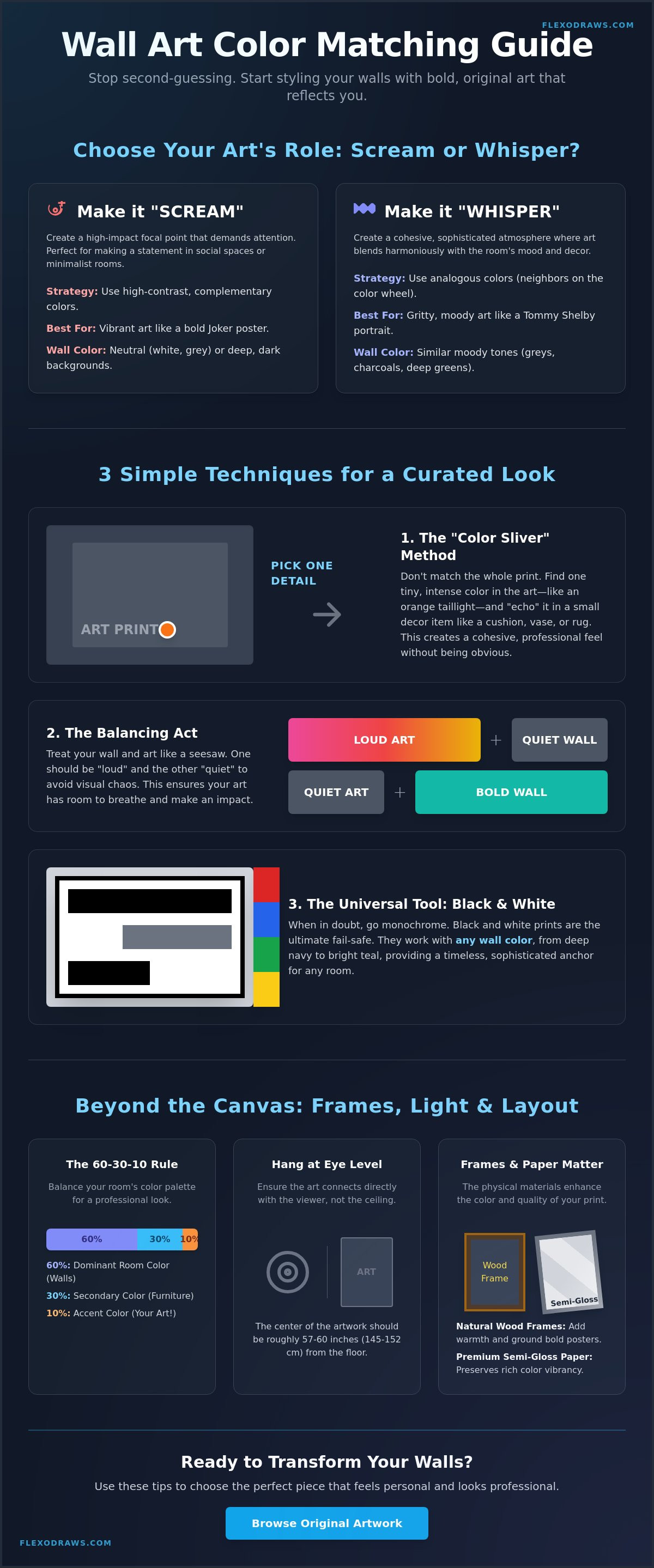
Choosing the right piece isn't just about the subject; it's about how the pigment hits the room. This wall art color matching guide starts with a simple choice: do you want the art to scream or whisper? To make a decision, you need to understand basic color theory principles. High-contrast prints, like a vibrant Joker poster, demand attention. They work best on neutral walls or deep, dark backgrounds where the colors can breathe without competition.
Don't try to match every color in the print to your wall. That's a mistake. Instead, use the "Color Sliver" method. Pick one tiny, intense detail in the artwork. It could be the orange glow of a car's taillight or the green of a character's eyes. Match that single sliver to a cushion or a rug. It creates a professional, curated look without feeling forced. Always keep the wall "quiet" if the art is "loud." If your walls are a bold forest green, choose a print with more negative space to avoid a visual clash.
Complementary Colors for Maximum Impact
Complementary colors sit opposite each other on the wheel. Think of a blue-toned Nürburgring track map paired with warm oak furniture or orange accents. A bold red poster will practically vibrate against a deep navy or forest green wall. Complementary colors create a visual vibration that draws the eye and makes the artwork feel like an intentional statement. It's a high-energy approach perfect for social spaces or gaming rooms.
Analogous Palettes for a Cohesive Vibe
Analogous schemes use colors that sit next to each other. This is the path for the minimalist. Layering grey, black, and white tones creates a sophisticated, grounded atmosphere. A gritty, dark Tommy Shelby poster belongs in a room with similar moody tones. These prints don't need to shout to be seen. Pair them with focused lighting to highlight the premium semi-gloss finish and the depth of the original artwork. It's about texture and mood rather than raw contrast.
The Bold Print Strategy: Matching Pop Culture Art to Your Walls
Matching a movie icon to your living room isn't about finding the exact same shade of paint. It's about balance. Most interior guides ignore fan culture, but integrating a gritty Tommy Shelby poster requires a specific approach to crafting the perfect palette. If you have a room filled with minimalist furniture, a "chaotic" or high-energy print acts as the perfect counterweight. It prevents the space from feeling sterile.
Black and white prints are your universal tool. They are the safest bet for any wall color, from deep navy to bright teal. If you want to introduce color, use the "Accent Color Echo." A single orange line on a wall art color matching guide favorite like the Nürburgring Track Map Poster can tie in perfectly with a nearby lamp or a stack of books. This subtle repetition makes the art feel like it belongs in the architecture of the room rather than just hanging on it.
Styling Gritty and Iconic Character Art
Dark-themed art is a powerful anchor for light-colored rooms. A moody, shadow-heavy portrait provides a focal point that keeps a white or cream room from feeling washed out. The deep blacks in these original pieces interact with the texture of your wall, creating depth. For those looking to build a full display, check out these A3 Art Prints for gallery wall inspiration that balances fan passion with professional design.
Racing Prints in Neutral Spaces
Technical track maps offer a clean, geometric aesthetic that fits modern interiors perfectly. The crisp white background of a premium semi-gloss print should ideally match your ceiling or trim color to create a seamless look. It’s a professional way to display your passion for racing. Ready to upgrade your office? You should browse the latest original artwork and find a piece that speaks to your heritage.
Beyond the Canvas: Frames, Lighting, and Layout
The best artwork in the world can look dull if it's trapped in a poor environment. Interior designers often use the 60-30-10 rule to keep spaces balanced. Your dominant room color takes up 60%, secondary furniture fills 30%, and your art serves as the final 10% accent. This wall art color matching guide isn't just about paint; it's about how the physical print interacts with your room. Hanging art at eye level is the standard. It ensures the color connects directly with the viewer rather than getting lost near the ceiling.
The quality of the paper matters more than most people realize. Flexo Draws uses premium semi-gloss paper for every print. Unlike flat matte finishes, semi-gloss reflects light in a way that alters color vibrance throughout the day. In the morning, your racing prints might look crisp and cool. By sunset, the same colors will feel deeper and more saturated. This dynamic quality makes original artwork feel alive in your home. It's a technical detail that separates professional prints from mass-produced posters.
The Impact of Lighting on Color Perception
Lighting can make or break a display. Warm yellow bulbs often muddy vibrant blue tones, making them look greenish and dull. If you want your iconic movie posters to pop, use cool-toned LEDs. They preserve the integrity of the original pigments. Natural light shifts the temperature of your wall art throughout the day, moving from cool morning tones to warm evening hues. Position your prints where they can catch indirect sunlight to see the full range of the Gelato printed quality.
Choosing the Right Frame Color
A black frame is the safe but superior choice for pop culture art. It acts as a visual buffer, separating the bold colors of the print from the wall behind it. This is essential for gritty portraits like Tommy Shelby. For minimalist racing maps, a white frame can extend the clean aesthetic of the print. The frame provides a border that keeps the eye focused on the subject. It's the final touch that turns a poster into a piece of premium decor. Ready to transform your space? PUT UP SOME ART.
Transform Your Space with Bold Original Art
You now have the tools to move beyond safe, boring walls. This wall art color matching guide has shown you how to anchor a room with high-contrast character portraits and geometric racing maps. It's about more than just paint. It's about how your lighting hits the premium semi-gloss finish and how a black frame creates that essential visual buffer. You don't need to be an interior designer to get this right. You just need to be intentional with your choices.
Don't let the fear of clashing colors stop you from displaying what you love. Whether it's a gritty movie icon or a detailed track map, your home should reflect your passion. You can balance bold, chaotic energy with professional styling by following the 60-30-10 rule. Every piece in our shop is Original Artwork. These are iconic movie and racing prints designed to last. They aren't mass-produced. They are crafted for fans who value quality and artistic integrity.
Ready to make a statement? PUT UP SOME ART - Explore the Flexo Draws Collection and find the perfect print for your space. Your walls are a blank canvas. It's time to start building your gallery wall with confidence.
Frequently Asked Questions
Does my wall art have to match my sofa color?
No, matching your art exactly to your sofa is a common mistake that leads to a flat, uninspired room. Your art should introduce a new energy or pick up a minor accent color from your furniture instead. If you have a neutral sofa, a vibrant Joker poster adds a necessary focal point. If the sofa is already bold, choose a more minimalist racing map to balance the visual weight of the space.
Can I hang a colorful movie poster on a brightly colored wall?
Yes, but you must follow the "quiet vs loud" principle mentioned in this wall art color matching guide. A vibrant Stranger Things poster on a deep navy wall works because the dark background lets the colors breathe. If the wall and art are both extremely bright, the room can feel chaotic. Use a black frame to create a visual break between the print and the paint to prevent a clash.
What is the best wall color for black and white art prints?
Deep, moody colors like charcoal or navy provide the best backdrop for black and white prints. These dark tones make the white highlights of the art pop with intense clarity. For a minimalist look, hanging a black and white Tommy Shelby poster on a light grey wall creates a sophisticated, analogous palette. It is a universal choice that brings a professional, gallery-style feel to any room in your home.
How do I choose a frame color that doesn't clash with my art?
Choose a frame that matches the dominant line work or the darkest tone within the art itself. A black frame is the most reliable choice for iconic movie posters because it anchors the piece and focuses the eye. For technical prints like a Nürburgring track map, a white frame keeps the aesthetic clean and modern. Avoid using colorful frames that compete with the original artwork for attention.
Should I match my art to my rug or my curtains?
Pick one small detail from the art to "echo" in your rug or curtains rather than trying to match the entire piece. This is the "Color Sliver" method. If your Jaws poster has a tiny flash of red in the title, a rug with subtle red accents will tie the room together perfectly. This approach ensures your wall art color matching guide strategy feels intentional rather than accidental or over-styled.