


How to Style Pop Culture Posters: The 2026 Gallery Wall Guide
A poster of The Joker or Tommy Shelby shouldn't make your living room look like a freshman dorm. You've outgrown the days of blue tack and wrinkled paper, but you still want your walls to reflect the films and icons you love. Knowing how to style pop culture posters is the difference between a cluttered bedroom and a professional, curated gallery. It's a common struggle to match different movie themes without the space feeling immature or chaotic.
This guide will show you how to transform your home office or living room into a sophisticated space using bold, original artwork. We promise to help you showcase your fandom with artistic integrity, moving away from cheap materials toward premium quality. You'll learn the best practices for choosing cohesive color palettes, selecting high-end frames, and planning a layout that protects your walls. From minimalist line art to vibrant, limited edition prints, we are going to dive into the exact steps for a perfect 2026 gallery wall. PUT UP SOME ART.
Key Takeaways
- Learn why minimalist pop culture art is the secret to transforming a room from a dorm-style setup to a professional gallery.
- Discover the five-step process for how to style pop culture posters using anchor pieces and intentional color coordination.
- See how to seamlessly blend different passions, like motorsport track maps and cinematic legends, into one cohesive home office theme.
- Find out how to create a "Gritty Cinema" corner that showcases your favorite characters with genuine artistic integrity.
Selecting Pop Culture Art That Elevates Your Room
Pop culture art is more than just fandom. It bridges the gap between childhood nostalgia and high-end interior design. Rooted in the Pop Art Movement, these pieces take familiar icons and turn them into visual statements. When you learn how to style pop culture posters, you're looking for art that feels intentional. It's not about filling a gap on a wall. It's about finding original artwork that captures the grit of a Tommy Shelby poster or the chaotic energy of The Joker.
Why Minimalism Wins in 2026 Decor
Minimalist designs are the gold standard for sophisticated homes. A minimalist poster design strips away the noise, focusing on clean lines and bold silhouettes. This approach prevents your room from feeling cluttered. It allows a single, vibrant image to breathe. If you're styling a bold character portrait, the "less is more" philosophy ensures the art remains the hero without overwhelming the space.
The Impact of Print Quality
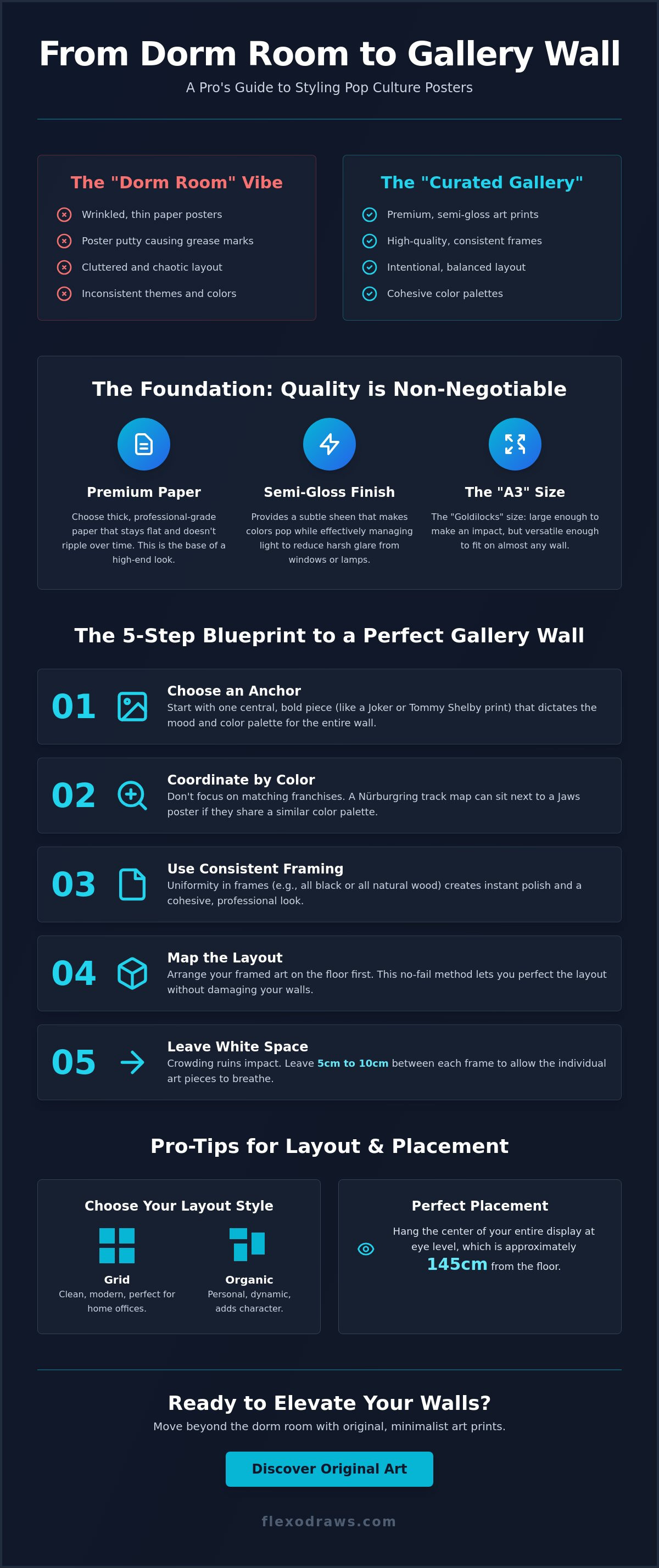
The biggest mistake is settling for thin, mass-produced paper. Professional gallery walls require premium semi-gloss A3 art prints. We use Gelato printed quality to ensure every color is deep and every line is sharp. Thick paper matters. It stays flat in the frame and doesn't ripple over time. This technical standard is what separates a professional gallery from a teenager's bedroom.
Semi-gloss finishes are essential for modern rooms. They provide a subtle sheen that makes colors pop, but they also manage room lighting effectively. This reduces harsh glare from windows or lamps. When you choose high-quality prints, your fandom looks like a curated collection, not a temporary setup. PUT UP SOME ART that reflects your standards.
5 Practical Steps to Style Minimalist Art and Iconic Prints
Creating a cohesive display doesn't happen by accident. If you're wondering how to style pop culture posters without the "college dorm" vibe, you need a framework. A professional gallery wall relies on balance and intent rather than just filling empty space. Follow these five steps to elevate your collection.
- Choose an Anchor: Start with one central piece that dictates the mood. A bold Tommy Shelby poster or a vibrant Joker print works best as the visual weight.
- Coordinate by Color: Don't get stuck on franchises. A Nürburgring track map can sit next to a Jaws poster if they share a similar palette.
- Use Consistent Framing: Uniformity in frames creates instant polish. Black or natural wood frames are ideal for A3 art prints.
- Map the Layout: Lay your art on the floor before touching a hammer. This allows you to test a no-fail gallery wall formula without damaging your walls.
- Leave White Space: Crowding ruins the impact. Leave 5cm to 10cm between frames to let each piece breathe.
Mastering the Gallery Wall Layout
Decide between a "Grid" or "Organic" layout. Grids are perfect for a clean, modern home office. Organic layouts feel more personal and chaotic in a good way. Keep the center of your display at eye level, which is usually about 145cm from the floor. This ensures your original art prints are seen exactly as intended.
Framing Tips for A3 Posters
A3 is the "Goldilocks" size. It's large enough to be noticed but small enough to fit almost any wall. Avoid "poster putty" at all costs. It leaves grease marks and looks amateur. Proper frames protect your investment and turn a simple print into a permanent piece of decor. Choose high-quality frames to match the premium semi-gloss finish of your posters. PUT UP SOME ART.
Theme-Driven Styling: From Racing Tracks to Cinematic Legends
Mixing different fandoms is the ultimate way to personalize your space. You don't have to choose between the track and the theater. By using minimalist motorsport art alongside cinematic legends, you create a narrative that is uniquely yours. The secret is the shared aesthetic. A sleek car silhouette has the same visual weight as a minimalist character portrait. This is how to style pop culture posters with a professional edge. It is about the vibe, not just the subject matter.
Create a "Gritty Cinema" corner for a high-impact look. Combine your Joker and Peaky Blinders prints in one area. Use dark frames and moody lighting to highlight the vibrant details of the original artwork. This creates a focused zone of interest that feels like a curated gallery. For a balanced look, try the "Triptych" method. Styling three related A3 prints in a perfectly straight horizontal row creates a window-like effect. It anchors the wall and provides a sense of order amidst the chaotic energy of the art.
The Racing Fan’s Office
A Nürburgring Track Map Poster is more than a map. It's a geometric masterpiece. In an office setting, it acts as abstract art for those who don't know the Green Hell, and a badge of honor for those who do. Pair it with technical-style character portraits to balance the mechanical with the human. It's sophisticated. It's precise. It's a statement of quality that reflects your passion for the craft.
The Modern Home Cinema Vibe
Your home theater shouldn't look like a commercial lobby. Use minimalist movie posters to keep the vibe upscale. Stick to a shared color scheme, perhaps reds, blacks, and greys, to tie different genres together. This creates a cohesive visual flow from horror to drama. Whether it's a Jaws poster or a Stranger Things print, the minimalist approach keeps it mature. Stop staring at blank walls. It's time to transform your space. PUT UP SOME ART.
Transform Your Walls Into a Professional Gallery
Your living space should reflect your personality without sacrificing sophistication. Mastering how to style pop culture posters comes down to making intentional, high-quality choices. We've covered how to select minimalist designs that prevent clutter, coordinate by color palettes rather than just franchises, and use consistent framing to protect your investment. Moving from temporary wall fillers to a curated collection is a massive upgrade for any home office or living room.
Technical quality is the foundation of a great gallery. Every piece of original artwork from Flexo Draws is Gelato printed on premium semi-gloss paper. This museum-grade standard ensures that your favorite cinematic legends and racing tracks look sharp and vibrant under any lighting conditions. Don't settle for mass-produced alternatives that fade, ripple, or look cheap. You deserve art that matches your passion and your standards.
Ready to start building your ultimate display? PUT UP SOME ART: Shop Original A3 Prints at Flexo Draws. Whether you're starting with a single anchor piece or planning a full triptych, your journey to a better home aesthetic starts here. It's time to build a space you're proud to show off.
Frequently Asked Questions
How do I style pop culture posters without them looking childish?
Focus on minimalist original artwork and professional framing to avoid an immature look. Using premium semi-gloss A3 art prints provides a sophisticated finish that feels like a high-end gallery. Avoid cheap tape or putty; these damage the paper and look temporary. Stick to clean lines and bold silhouettes that highlight the artistic integrity of the piece. Proper frames in black or natural wood instantly elevate the art.
Can I mix movie posters with different art styles on the same wall?
You can absolutely mix different genres like a Nürburgring Track Map and a Tommy Shelby poster by using a unifying color palette. Consistency in framing helps tie varying art styles together. This creates a cohesive narrative across your home office or living room walls. It's about finding a visual balance between geometric track maps and character-driven portraits. If the colors harmonize, the franchises don't need to match.
What is the best frame size for an A3 art print?
The best choice is a standard A3 frame for a clean, edge-to-edge look. If you want a more traditional gallery feel, use a larger frame with a white mount or matting. This adds essential "white space" around the print and makes the artwork feel more substantial on a large wall. Always ensure the frame is sturdy to protect the Gelato printed quality of your posters. It's a small investment for a professional result.
How do I choose a colour palette for my gallery wall?
Pick two or three dominant colors from your favorite prints to guide your selection. If you have a vibrant Joker poster, look for other pieces with similar tones or neutral backgrounds to keep the wall balanced. This is a key part of how to style pop culture posters effectively. Using black frames helps ground the colors and ensures the display feels unified rather than chaotic. PUT UP SOME ART with confidence.