


Wall Art Decorating Mistakes: The Ultimate Checklist for a Professional Look
Why does your favorite racing print look like a masterpiece in the gallery but a dorm room relic on your living room wall? You’ve invested in original artwork, yet the vibe feels off. Most homeowners fall into common wall art decorating mistakes that shrink the visual impact of their space. It isn't always about the budget. It is about the scale, the height, and the intention behind every piece you hang. You want a home that feels like a curated exhibition of your passions, not a cluttered collection of mismatched frames.
It’s frustrating when a premium semi-gloss print looks swallowed by a large wall or when your Tommy Shelby poster sits so high it feels disconnected from the furniture. We agree that your space should reflect your personality with professional polish. This checklist will teach you how to avoid these errors and achieve a high-end gallery look. We will cover the "eye-level" rule, how to scale your A3 prints correctly, and the secrets to mixing iconic movie and racing designs. It’s time to stop guessing and start building a bold, fan-centric sanctuary. PUT UP SOME ART.
Key Takeaways
- Master the "eye level" rule to stop hanging art too high and learn to scale A3 prints for large walls.
- Ditch generic decor for original artwork that reflects your passion for film and racing.
- Avoid common wall art decorating mistakes by choosing premium semi-gloss paper to stop distracting glare.
- Build a professional gallery look with the confidence to mix different iconic prints into one cohesive display.
Scaling and Placement: Avoiding the Floating Art Trap
Hanging a single poster on a vast, empty wall is one of the most common wall art decorating mistakes. It makes your favorite prints look like an afterthought rather than a design choice. An A3 art print is bold and detailed, but it needs the right environment to shine. If you leave too much space around a single piece, it looks lost. It floats. You want your decor to feel intentional and grounded. Stop treating your walls like an infinite void and start treating them like a curated gallery. Put up some art with purpose.
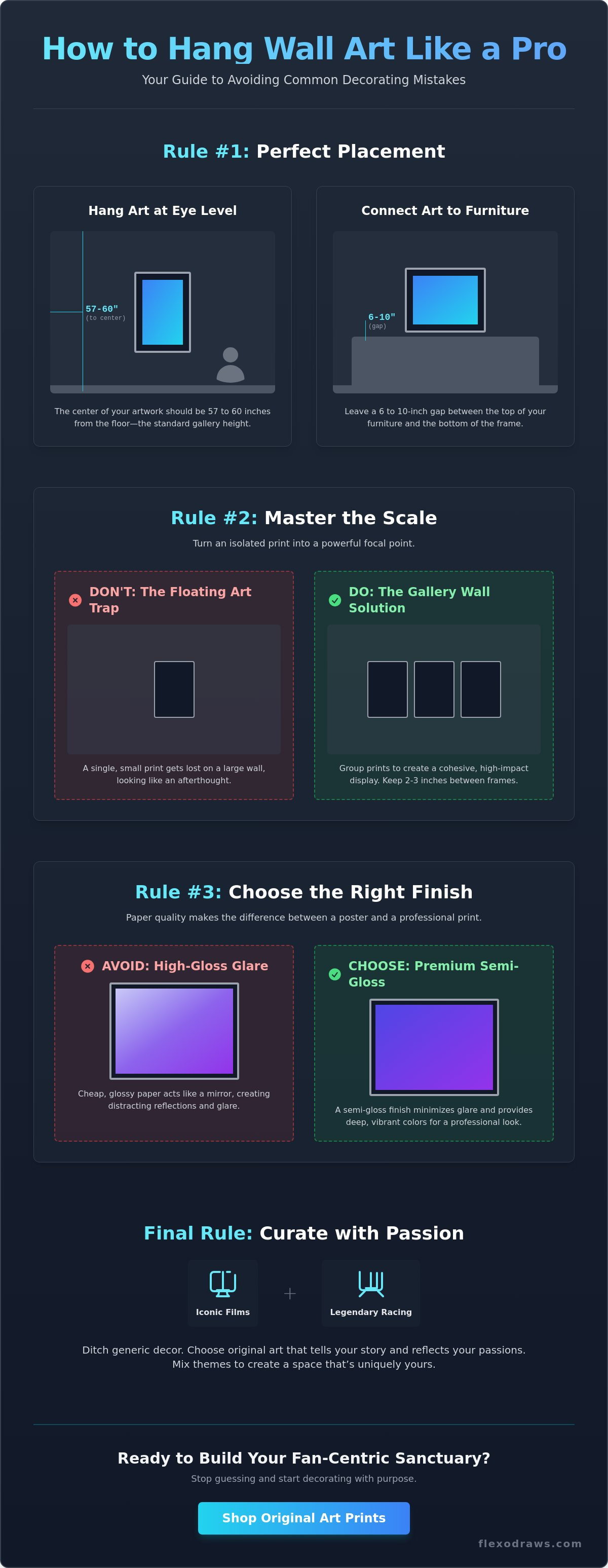
The Golden Rule of Hanging Height
Stop hanging your art six inches too high. Most people treat their walls like a billboard for giants. Instead, aim for the center of the print to be 57 to 60 inches from the floor. This is the standard gallery height. It keeps the artwork at eye level for the average person. If you’re hanging a Tommy Shelby poster above a sideboard or desk, lower it. You want about 6 to 10 inches of breathing room between the furniture and the bottom of the frame. This creates a visual connection rather than a disjointed gap. It makes the art feel part of the room's furniture arrangement.
Mastering the A3 Gallery Wall
A single A3 print might struggle on a massive sofa wall, but a cluster of them is a powerhouse. Grouping your Nürburgring track map poster with a Mondello Park print creates a high-impact focal point. Use a tight grid layout for a clean, professional "racing pit" or "cinema" vibe. It turns a collection of prints into a singular statement. Keep the spacing consistent. Aim for 2 to 3 inches between each frame. This uniform gap makes the collection feel like one large, cohesive unit. This approach helps you avoid common wall art decorating mistakes that make a room feel cluttered. Understanding the importance of framing helps here; identical frames in a grid look sharp, while mixed frames tell a more personal story. Just ensure the centers stay aligned for a balanced look.
Curation Mistakes: Ditching Generic Decor for Original Art
Walking into a home and seeing the same generic mountain landscape found in every big-box store is a vibe killer. It is the "Hotel Room" error. This is one of the biggest wall art decorating mistakes because it lacks soul. Your home shouldn't feel like a lobby; it should feel like you. Generic art is filler. It takes up space without saying anything. Original artwork carries a specific energy that mass-produced prints simply can't replicate. It shows you have a perspective and a passion for the things you love.
Don't be afraid to mix your interests. A technical Nürburgring Track Map Poster can absolutely live next to a gritty, cinematic portrait of a film icon. This contrast creates a chaotic artistic integrity that looks curated rather than staged. While experts often discuss how to hang art correctly to ensure technical balance, the subject matter should remain personal. A space that is "too perfect" often feels sterile. Real homes have layers of passion and history.
Finding Your Personal Theme
Avoiding common wall art decorating mistakes starts with curation. Every piece on your wall must earn its place. Focus on subjects that actually move you. This might include:
- Iconic film characters like the dark intensity of a The Joker Poster.
- Legendary racing circuits that remind you of the roar of an engine at Mondello Park.
- Vibrant, original designs that capture a specific pop-culture moment.
When you choose art based on genuine fandom, the room starts to tell a story. Avoid buying something just because the colors match your cushions. That is a trap. Buy it because the moment it captures is iconic to you.
The Impact of Originality
Original prints from an independent creator offer a level of detail and vibrant color that mass-market posters miss. These designs are often more daring. They use bold lines and striking palettes to grab attention. In a minimalist room, one vibrant, original piece does more work than five bland ones. It is about the tangible quality of the print and the creative spirit behind it. If you want a space that stands out, you need to choose art that makes a statement. PUT UP SOME ART.
Finishing Touches: Why Paper Quality and Framing Matter
You’ve picked the perfect subject and found the right spot on the wall. But if you print a masterpiece on flimsy paper, it will never look professional. One of the most frustrating wall art decorating mistakes is ignoring the finish of the print itself. Cheap, high-gloss posters act like mirrors. They catch every light bulb and window reflection, turning your favorite racing or movie scene into a glare-filled mess. It looks like plastic. It feels temporary. Professional decor requires a surface that lets the colors breathe without blinding the viewer.
Premium semi-gloss is the industry secret. It delivers vibrant, deep blacks and saturated colors while diffusing light. This finish ensures your art looks sharp from every angle in the room. Avoiding common wall art mistakes often comes down to these physical details. Don't ruin a high-quality print by using blue-tack or tape. Adhesives damage the paper and look amateur. A frame doesn't just protect the art; it provides a border that commands respect and draws the eye inward.
The Importance of Premium Paper
Weight matters. Thin paper tends to "wave" or ripple once it sits inside a frame, especially in humid environments. Choosing a heavier, premium weight prevents this distortion. This is essential for styling your A3 Art Prints effectively. A thick, semi-gloss page stays flat and maintains its artistic integrity for years. It feels substantial. It feels like a limited edition piece rather than a mass-market flyer.
Simple Framing Solutions
You don't need a custom-built museum display to make an impact. Standard A3 frames are widely available and provide a clean, modern finish. To unify a chaotic gallery wall, keep your frame colors consistent. If you have a mix of movie posters and track maps, using all black or all wood frames ties the different subjects together. This consistency is the final step in fixing common wall art decorating mistakes. It turns a collection of prints into a professional home gallery. Stop staring at those blank, empty walls. It’s time to be bold. PUT UP SOME ART.
Transform Your Space Into a Bold Gallery
You now have the tools to fix common wall art decorating mistakes. By lowering your frames to eye level and grouping A3 prints into cohesive grids, you eliminate the floating art trap once and for all. Swapping generic decor for original artwork that reflects your passion for cinema and racing creates a space with authentic character. Every choice, from the height of the nail to the weight of the paper, builds a professional look that tells your story.
Don't settle for mass-produced filler. Flexo Draws provides original artwork printed on premium semi-gloss paper for a vibrant, gallery-ready finish. We offer global shipping on all our A3 art prints, ensuring your favorite racing circuits and film icons arrive ready for display. High-quality decor is about more than just filling a gap. It's about celebrating what you love with artistic integrity.
PUT UP SOME ART: Browse the Flexo Draws Original Collection
Your home deserves to be as iconic as the moments you admire. Start building your collection today and watch your space transform.
Frequently Asked Questions
How high should I hang my A3 art prints?
Hang your A3 art prints so the center of the piece is 57 to 60 inches from the floor. This standard gallery height keeps your artwork at a natural eye level for most viewers. If you're placing it above a sideboard or desk, leave a gap of 6 to 10 inches between the furniture and the frame. This ensures the piece feels connected to the room rather than floating aimlessly. It’s a simple fix for a professional look.
Can I mix movie posters with car track maps on the same wall?
You can absolutely mix movie posters with racing track maps. Combining a cinematic portrait with a technical circuit design creates a chaotic yet curated energy that reflects your personality. To avoid common wall art decorating mistakes, use identical frames to unify these different subjects. This consistent border provides a professional finish that makes the collection look intentional and high-end. It turns your wall into a bold, fan-centric gallery.
What is the best way to arrange a gallery wall without making it look cluttered?
Use a structured grid layout with exactly 2 to 3 inches of space between each frame to keep things clean. This uniform spacing prevents your gallery from looking like a cluttered mess. Stick to a specific color palette or frame style to create a sense of order. A tight arrangement of four or six A3 prints creates a massive visual impact without overwhelming the room's design. It’s about balance, precision, and intentionality.
Why does my wall art look too small for my room?
Your art looks too small because it isn't covering enough of the available wall surface. Placing a single A3 print on a large sofa wall is one of the most frequent wall art decorating mistakes. To fix this, group multiple prints together to create a larger focal point. Your art should generally cover over half of the wall space above your furniture to feel proportional and balanced. It’s all about scale and impact.